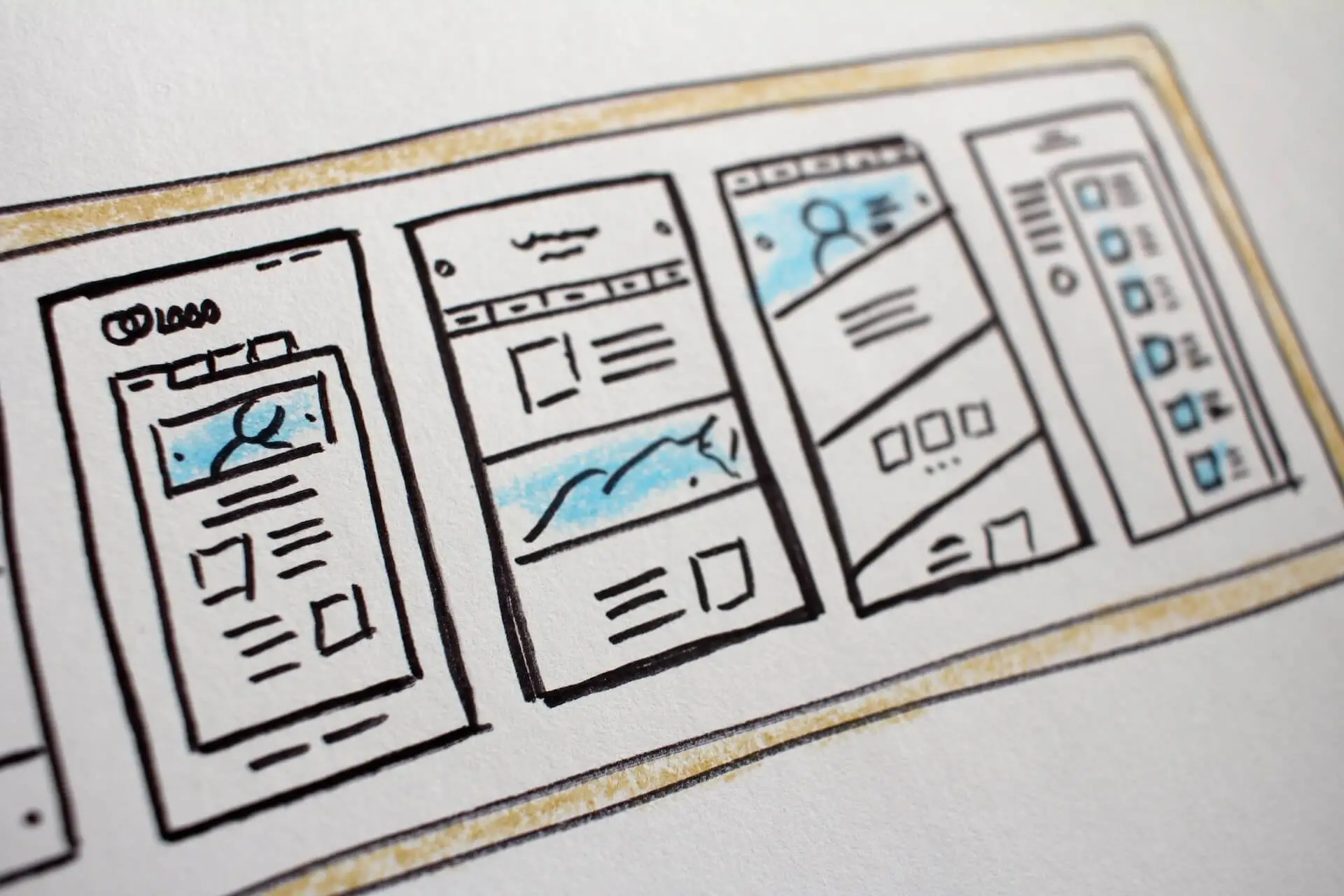

Landing page optimization is critical to any marketing strategy. Landing pages are a great way to generate more conversions for your business. A landing page is a one-page website that converts visitors into customers by offering them something specific, such as an offer or lead magnet.
Landing pages are usually designed with three goals in mind. An attention-grabbing headline, persuasive copy that emphasizes your USP (unique selling point), and quality design to encourage trustworthiness.
You’ll see better conversion rates when you have these three components of a landing page optimized! This blog post will discuss 14 tips for increasing conversions on your landing page!
The attention-grabbing headline is one of the most critical elements of a landing page. It’s what will first catch your visitor’s eye, and it needs to be persuasive to get them to read further. Your headline alone can skyrocket your conversions.
Your headline should summarize what you’re offering on the page. It should be interesting enough to get the visitor to learn more. Once you’ve caught your visitor’s attention with a great headline, it’s essential to keep them interested with persuasive copy.
Your USP should be front and center on the page, and you should use strong language to convince the reader to convert. Remember, the goal of a landing page is to get leads!
Above the fold is one of the most critical places on your website to promote your USP. This is the portion of your website that is visible without having to scroll down.
It’s essential to ensure that this area is used to its full potential by highlighting your unique selling proposition. Your USP should be front and center on your homepage.
It should also be included in other vital areas of your website, such as your about page and contact page. You can also use it in your marketing materials, such as your brochures and business cards.
If you want people to do business with you, you need to make sure they know what makes you unique. Promoting your USP above the fold is a great way to do that.
People love stories – there’s something about them that helps us create strong connections with one another. When creating your landing page, think about how you can tell a story that will connect with your visitors.
Stories are a great way to capture attention and create an emotional response, encouraging people to take the desired action. For example, suppose you’re selling a product that helps people eliminate their debt.
In that case, you could tell the story of someone who was in debt but found themselves $20,000 richer after using your product. Stories are great because they help customers connect with what your brand is about and understand how it can benefit them.
Think of some of your favorite movies. They all had great stories, which is what made them great. Movies like Forrest Gump, Titanic, Batman the Dark Knight, I could go on and on, but I think you get the point.
Focus on telling stories in your landing page content, and your content will be more engaging to your audience.
Images and videos are a great way to break up text and make your landing page more visually appealing. However, many marketers abuse the use of images and videos on their pages – don’t simply slap up a random picture or video just for the sake of it!
Your image should be relevant to what you’re trying to sell and reinforce what you’re saying in your copy. If you’re selling a product like jewelry, for example, an image of someone wearing the piece would be relevant.
However, if your product is software, it’s not very useful to include an image of someone using a physical product. Make sure any photos you use are relevant and reinforce your USP.
Custom images work best in almost all situations. Hire a professional photographer to take pictures of people using your products. Do not rely on stock photos from sites like Unsplash or others.
Everyone uses stock images, and your content won’t stand out if you use stock photos.
Screenshot of white space
When designing a landing page, it’s essential to keep your design clean and simple. This means avoiding clutter and using basic shapes and colors whenever possible.
Use a minimalistic approach when you design your landing pages. One way to do this is by using whitespace. Whitespace is when you give your content a lot of space to breathe and space around your text and images and blocks.
Whitespace is also known as negative space. When creating your landing page, it’s essential to always keep this in mind. Some content creators don’t give their content any room, which will confuse your users.
It’s also essential to use a minimal amount of typefaces and make sure they are easy to read. Choose a type size that will be legible from a distance, and use bold or italic fonts sparingly to add emphasis where needed.
By keeping your design simple, you can ensure that your landing page is easy to navigate and visually appealing. This will help encourage visitors to stick around and learn more about your product or service.
So if you’re looking to create a landing page that’s both effective and stylish, remember to keep it simple!
Don’t overload your visitors with too much information or CTAs. If you make it difficult for them to find the CTA, they’ll be discouraged from taking action and will likely leave your site instead.
Make sure that all of the content on your page supports your primary goal, and remove any unnecessary distractions. CTA buttons should be large enough for people to easily click on them.
They also need to be placed above the fold, or within easy sight of where someone’s attention is focused (usually the top of the page). Sometimes it helps them stand out more if they animate when someone hovers over them with their mouse.
If you want to draw someone’s attention to your CTA, make sure they stand out in some way. For example, if the button is blue instead of grey, it will quickly catch people’s eyes.
If you were selling a health product, for instance, changing the color to green might make sense because green often reminds people of nature and health.
If you can, test different CTA buttons to see which ones work best for your landing page.
You might find that a specific type of CTA button works better for your audience than others. Try using different shapes, colors, and sizes to see what gets the best response.
Whatever you do, don’t bombard your visitors with too many buttons or CTAs. Stick to one or two main ones, and make sure the others support your main goal.
When people visit your landing page, you only have a few seconds to capture their attention and convince them to stick around. That means your copy needs to be concise and to the point.
Don’t try to cram too much information into your headline or body text – focus on the most critical information. As users spend more time on your page, they’ll become more invested in the content and be more likely to convert.
You can achieve this by writing persuasive copy that employs one or more of the following techniques:
Build an air of authority with a quote from someone well-known in your industry. If you don’t have any contacts, consider hiring a professional writer to create one for you.
This will add credibility to your product or service without coming across as selling too hard.
The tips above are just some common examples of persuasive copywriting – get creative! It doesn’t matter what type of text you produce; it could be like this article meant to inform readers about persuasion.
Speaking of design, simplicity is vital. One of the best ways to increase conversions on your landing page is to keep it simple.
This means avoiding clutter and overwhelming the visitor with too much information at once. Only include the most critical elements on the page, and make sure they’re easy to find and understand.
If your page is too busy or confusing, people will be more likely to leave without converting. Keep it simple, and you’ll see an increase in conversions in no time!
Getting testimonials
Social proof is a psychological principle stating that people are more likely to do something if they see others doing it first. In other words, if you can show your visitors that others have already been successful with your product or service, they’re more likely to convert too.
There are a few ways to do this:
Include customer testimonials on your landing page. These should be short and sweet and written in a casual tone of voice.
Show a photo of current customers using your product or service, and explain how it’s helped them solve their problems in an easy-to-understand way. For example: “Jon Beverley used our widget to increase traffic by 25%!” is more convincing than simply stating the number alone.
Display social media metrics on your landing page. This could include the number of followers you have on Twitter, Facebook, or LinkedIn.
Or, it could show how many people have shared your content on social media.
Creating a sense of social proof for your visitors makes them more likely to convert into customers.
The best way to optimize your landing page for conversions is to test different elements and see what works best. Try changing the headline, copy, design, or CTA to see which combination results in the highest conversion rate.
You can use tools like Google Analytics or Crazy Egg to track how people interact with your page and then make changes based on the data you collect.
The more you test, the better you’ll be able to optimize your landing page for conversions.
One of the best ways to increase conversions on your landing page is to offer your product or service a free trial. This allows the visitor to try before buying, which can be a significant deciding factor for some people.
Make sure your free trial is easy to sign up for and doesn’t require too much information from the visitor. You want it to be as easy as possible for them to start using your product or service.
If you can get people to try your product or service, they’re more likely to convert into paying customers.
While popups can be an effective way to increase conversions, you need to avoid overusing them. Suppose a visitor has already landed on your website, and they keep being interrupted by popups.
In that case, it will become very frustrating for them and could lead to bounce rates. Use a lightbox popup instead of a full-screen one to avoid overwhelming the user with information all at once.
And make sure the content of the popup is relevant to what the visitor is looking for. If you use popups sparingly and make sure they’re relevant to the user, you can see a boost in conversions.
Urgency and scarcity are psychological principles that state that people are more likely to take action if they feel like there’s a time limit or limited opportunity. In other words, you can use these principles to create a sense of urgency and make people want to convert right away.
There are a few ways to do this:
Include an expiration date on your offer. This could be a sale that’s only available for a certain amount of time, or it could be a free trial that expires after a certain number of days.
Make your offer exclusive. Only allow a certain number of people to sign up for your free trial, or give the first 50 customers a special discount.
The visitor is more likely to convert if you can create a sense of urgency and scarcity around your landing page.
One of the best ways to increase conversions on a landing page is to try and target different segments of customers.
For example, if you’re offering a free ebook in exchange for their contact information, change the CTA copy depending on which segment they are in.
If someone has already purchased from your company before, emphasize the benefits of receiving a free ebook.
If it’s someone completely new to you and your business, highlight how they can trust you by providing their contact information in exchange for something valuable.
The key to increasing conversions on your landing page is following these 14 tips. The more these principles you can implement into your design, the higher conversion rates will be, and the less time it’ll take for you to make a sale.
Try implementing them one at a time and track the results. I guarantee if you follow these 15 tips, you’ll see a significant increase in the number of conversions on your landing page!